Financial Regulatory Sandbox
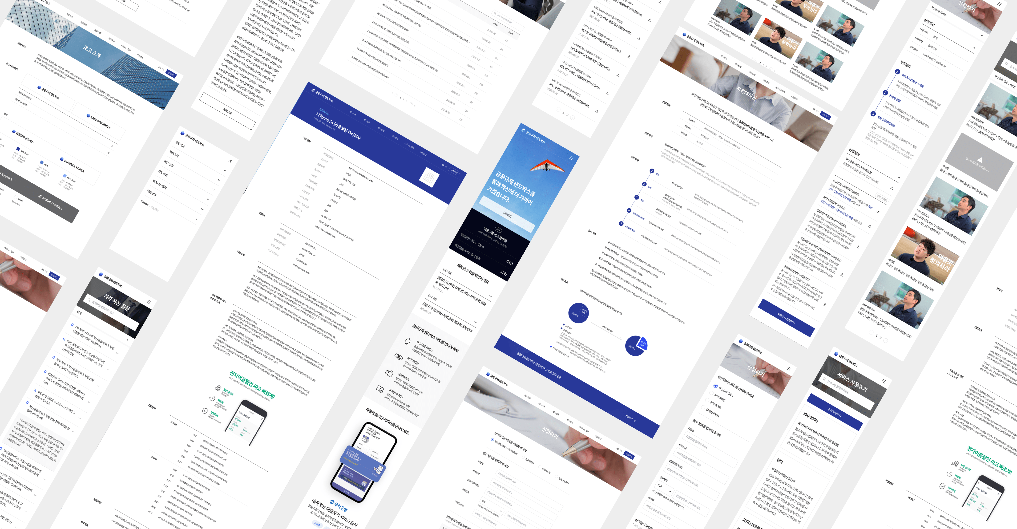
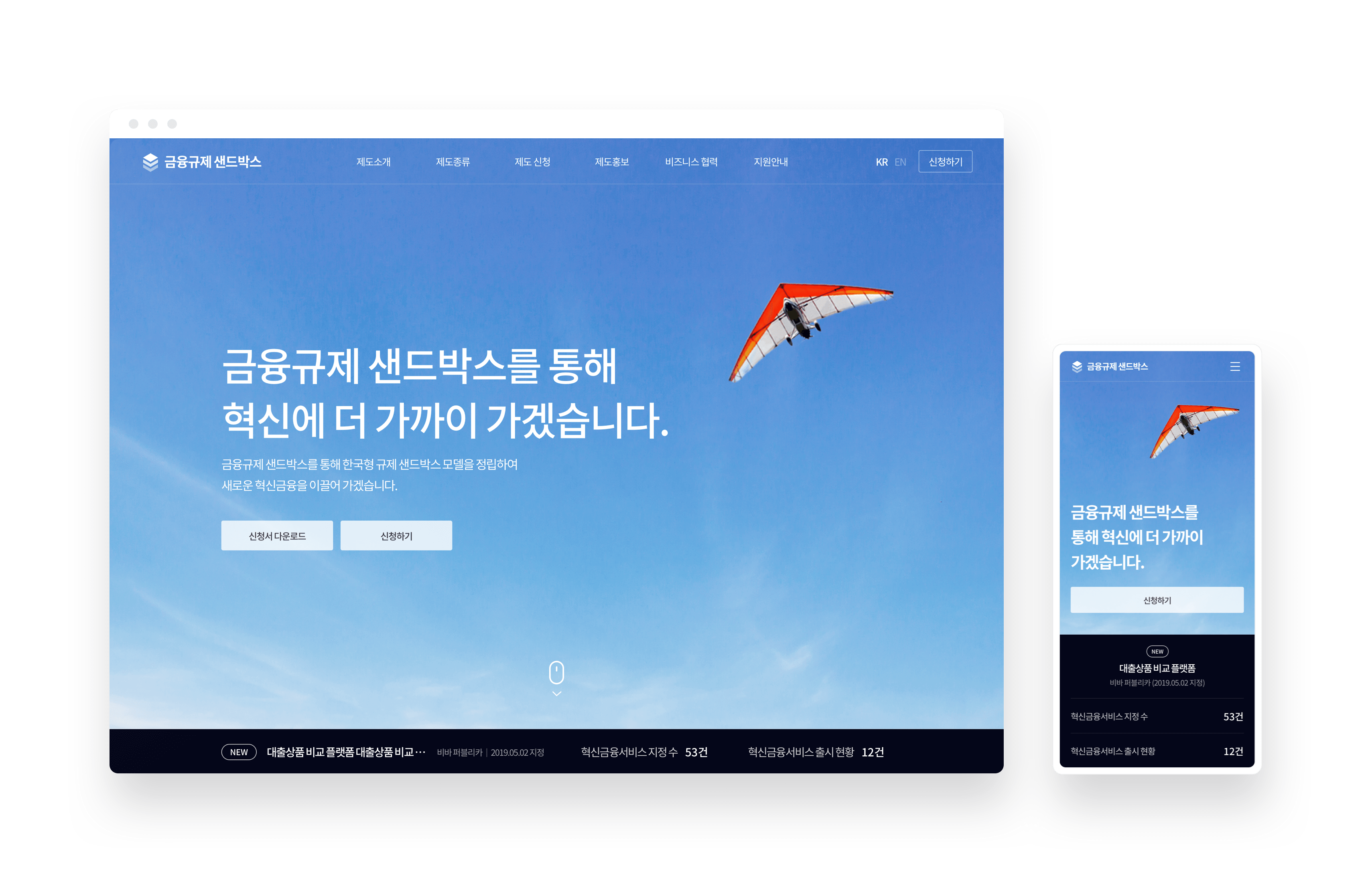
The Financial Regulatory Sandbox serves as a supportive platform for the introduction of innovative financial services to the market and aids in streamlining regulatory processes, thus enabling novel service experimentation. The website rejuvenation project targets simplifying traditionally complex regulations and optimizing operations. In an effort to depart from the overwhelming clutter of intricate government websites, we focus on redefining the structural design and consolidating content, fostering a seamless user experience that exudes reliability and positivity.


Project Goal
We’ve refined and repackaged the provided information to align seamlessly with the Sandbox’s ultimate objectives, intending to shift away from the typical overwhelming information found on government sites and instead facilitate a smooth and direct user journey towards the end goal.

- 1
금융규제 샌드박스의 소개 및 명확한 역할 설명,
서비스 인지도 향상 - 2
보다 간편해진 신청 방법 및 신청 유입 확대
- 3
다양한 디바이스 환경에 최적화된 디자인
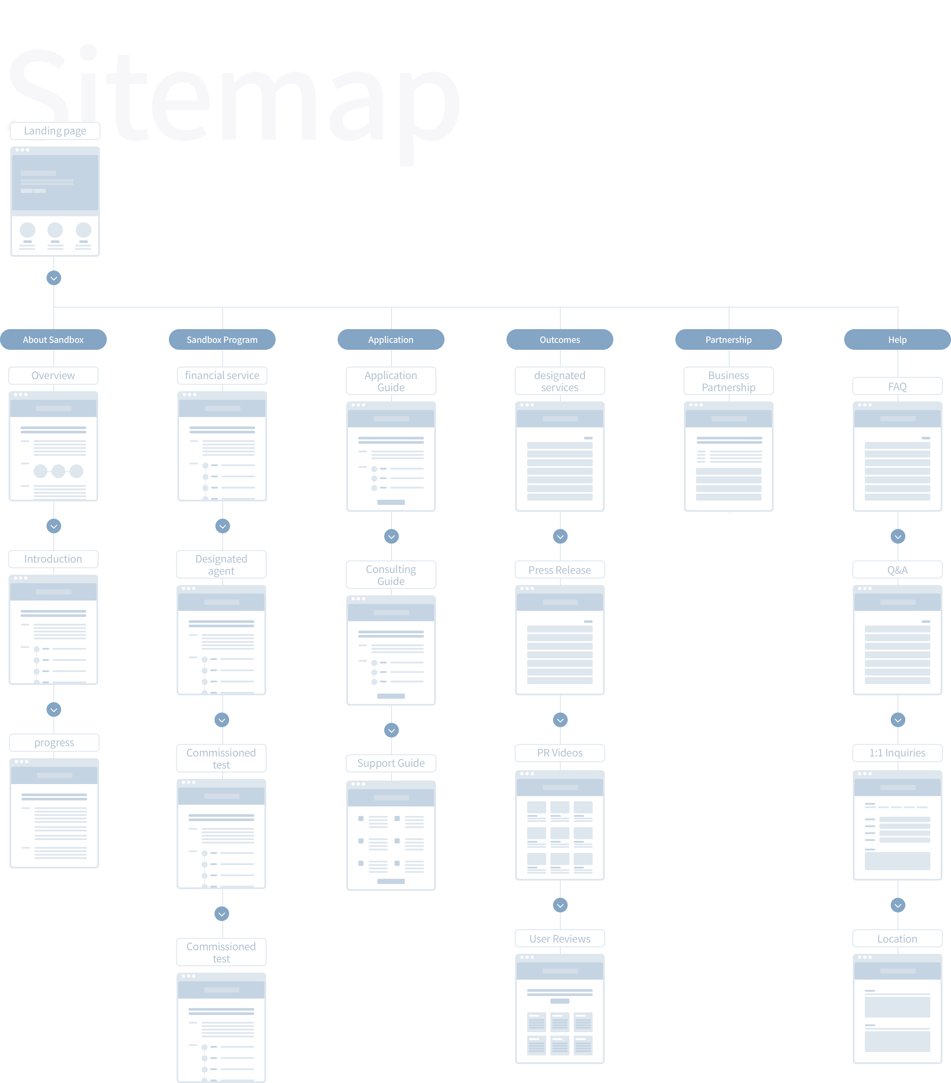
Appendix Prototype
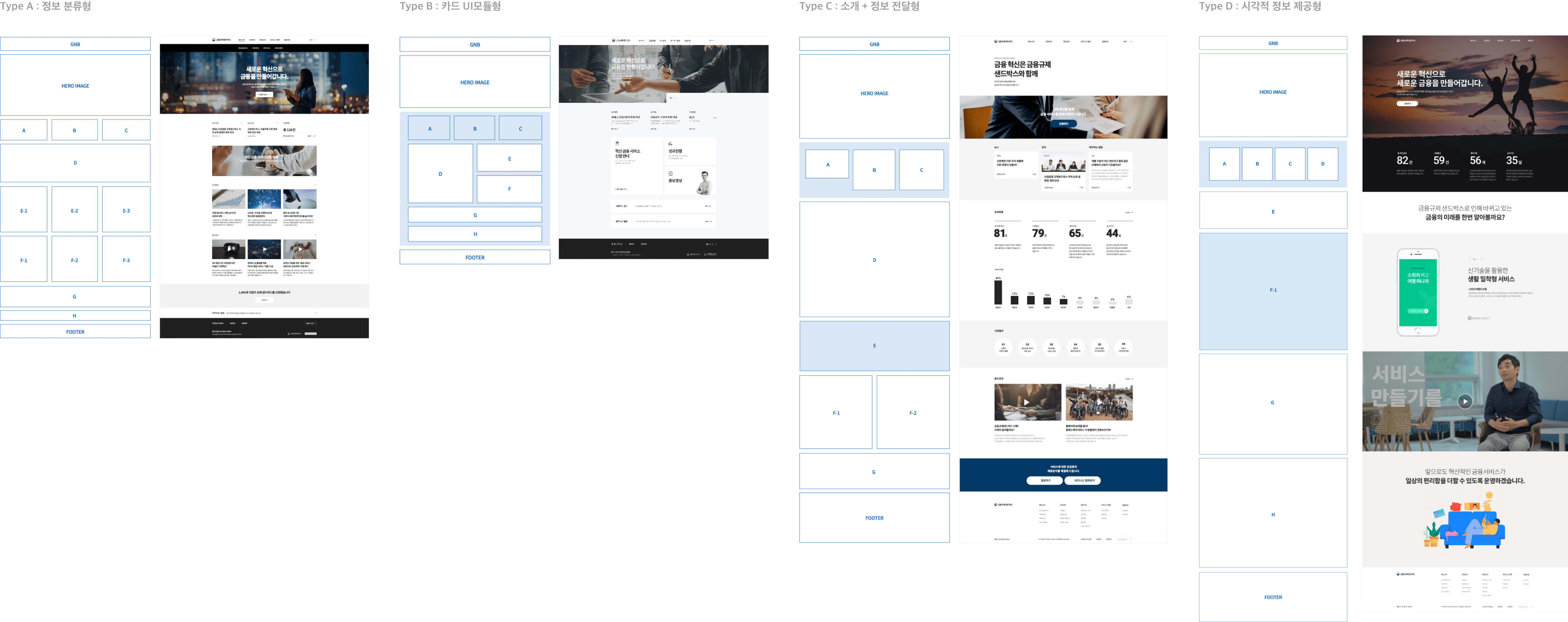
Relying on preliminary research, we prioritized readability in our content design, carefully balancing text and image elements to create impactful communication. We’ve proposed four strategic directions and implemented a responsive, web-optimized structure, guaranteeing consistent content delivery across various devices, a development we’ve coined as the DType.
Sub Page Structure
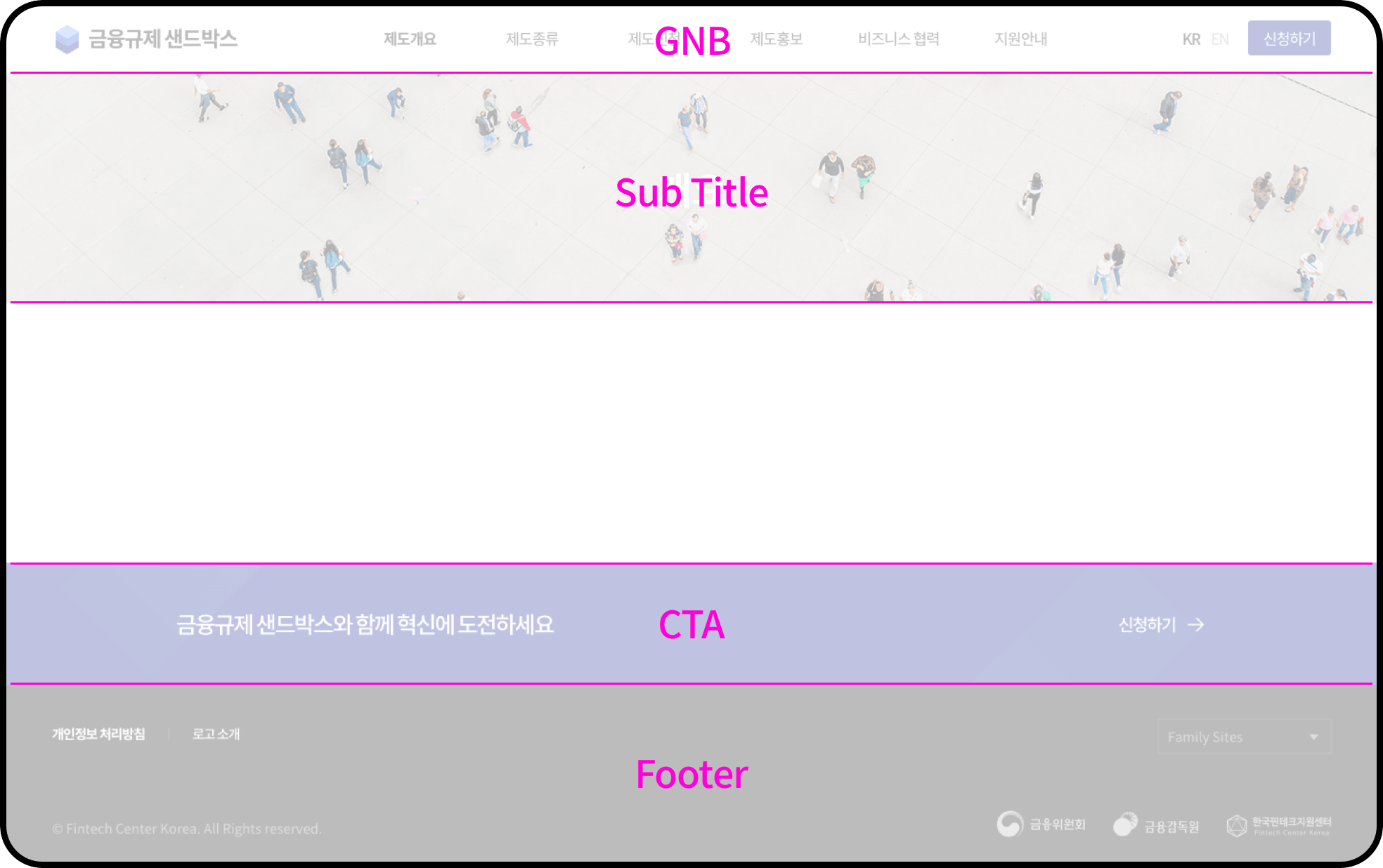
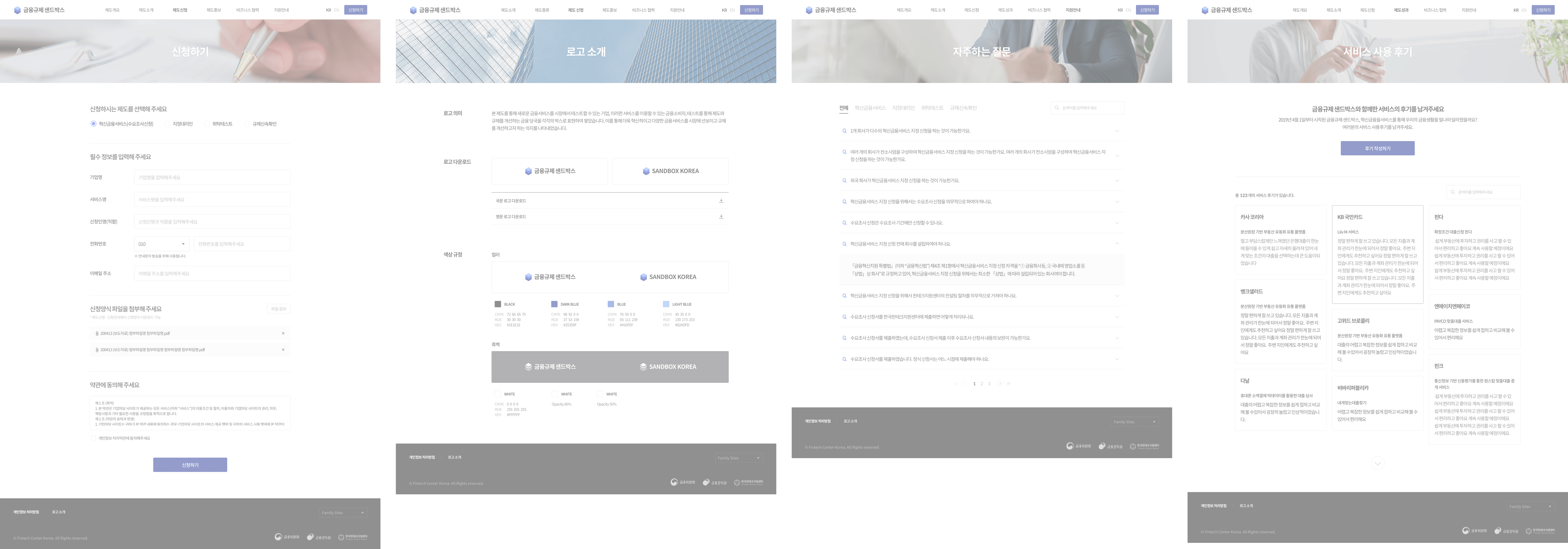
In each subpage, explanatory images are incorporated at the top, separating it from the predominantly text-oriented content and titles, facilitating quick and easy distinction from other pages. A prominent CTA (Call To Action) at the bottom encourages users to engage with the system.
Iconography
Guidelines
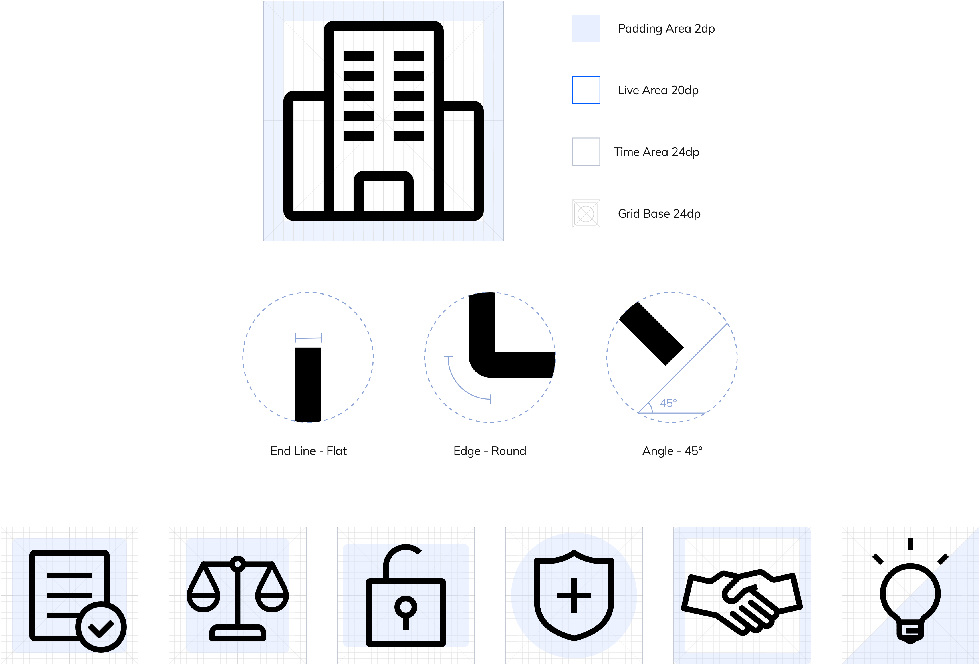
The use of line-style icons harmoniously integrates with the text, with rounded corners adding a soft touch, and the clean-cut ends of the lines contributing to a tidy, uncluttered presentation.
Web Screen