Jack&Pulse
Building Brand Sites
Samyang Foods is one of the domestic companies that plays a leading role in the development of Korea's food industry and food culture.
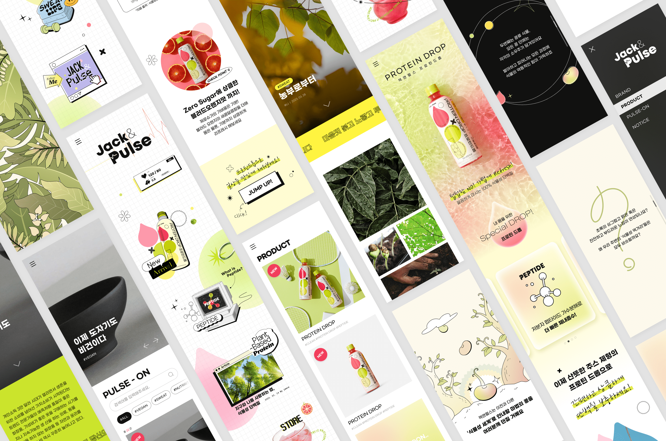
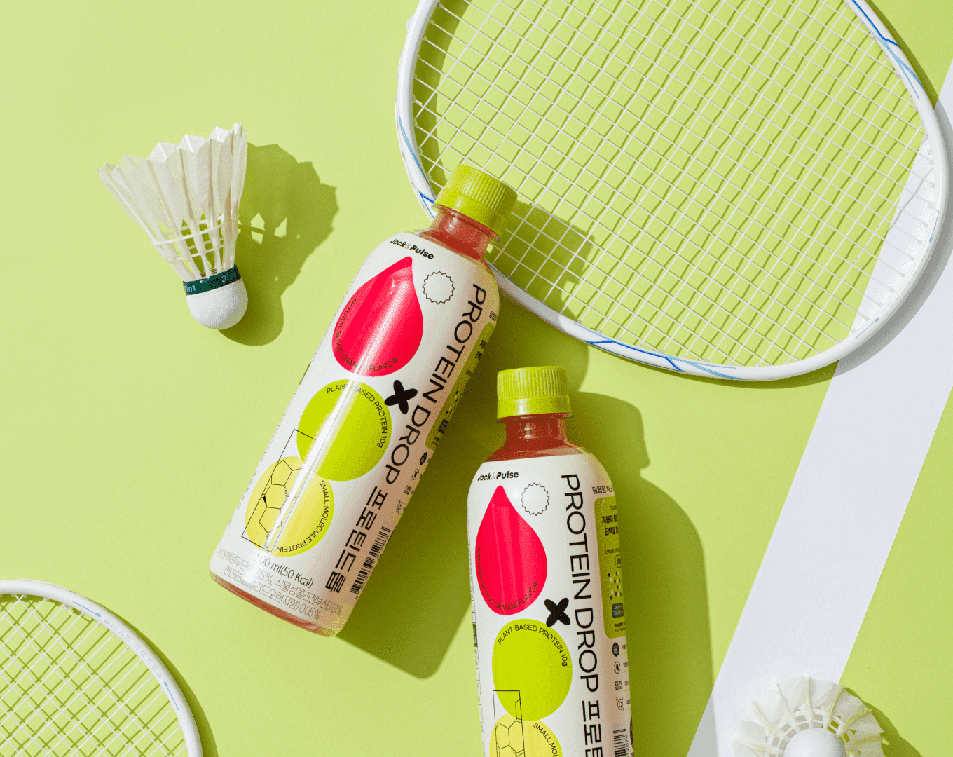
Among them, we created a website to introduce a new product brand called 'Jack&Pulse'. Using GUI images/interactions that can express Jack&Pulse's trendy and fresh brand by considering core targets, we composed content to convey the brand's newness and pleasure and to convey the value of a healthy and balanced Samyang food brand.
In addition, through Admin, the system has been established so that internal managers can register and manage products and articles in various formats.
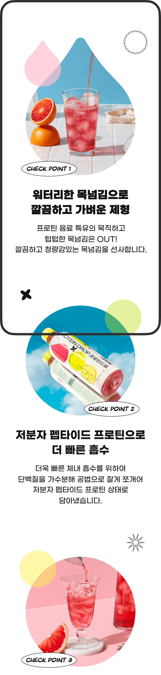
Jack & Pulse's unique and distinctive identity
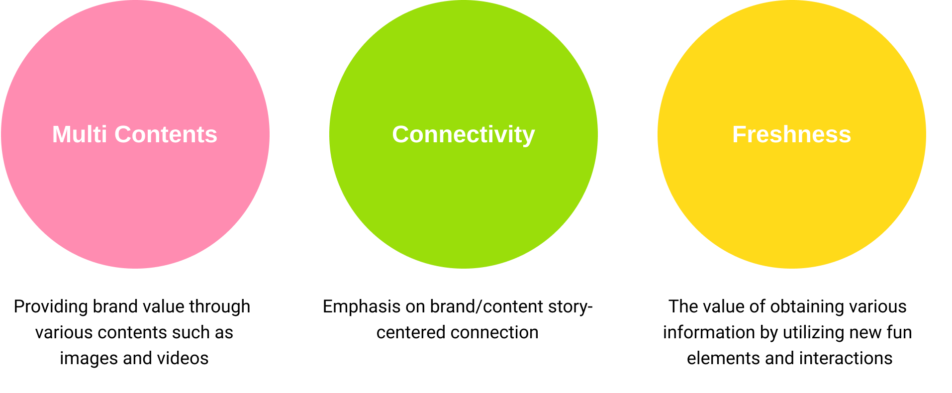
It effectively conveys information and messages that it creates healthy and safe products based on its unique and differentiated identity. Through this, we wanted to create a website that can easily convey Jack&Pulse's value and brand identity by providing a differentiated experience that is distinct from the existing Samyang Food Company Mall, thereby maximizing user entry and effectively delivering various contents in the future.
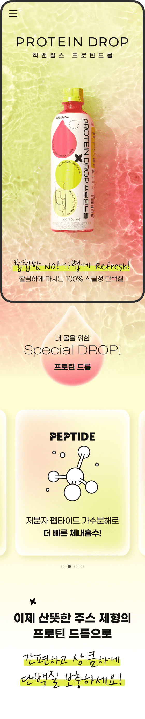
It delivers Jack & Pulse's message of a pleasant experience of challenging newness and finding and consuming your health, The product or service provides a seamless experience for the user.
Horizontal Layout
By utilizing horizontal scrolling and an atypical composition of various contents that are different from the layout of the company's existing site, you can quickly acquire information on the main page, thereby increasing the concentration of the content.
Storytelling Structure
By emphasizing the connectivity of product and brand introduction, it was designed in a structure that allows natural site exploration. It also provided an experience for users to immerse themselves through various interactions.
Simple Split Layout
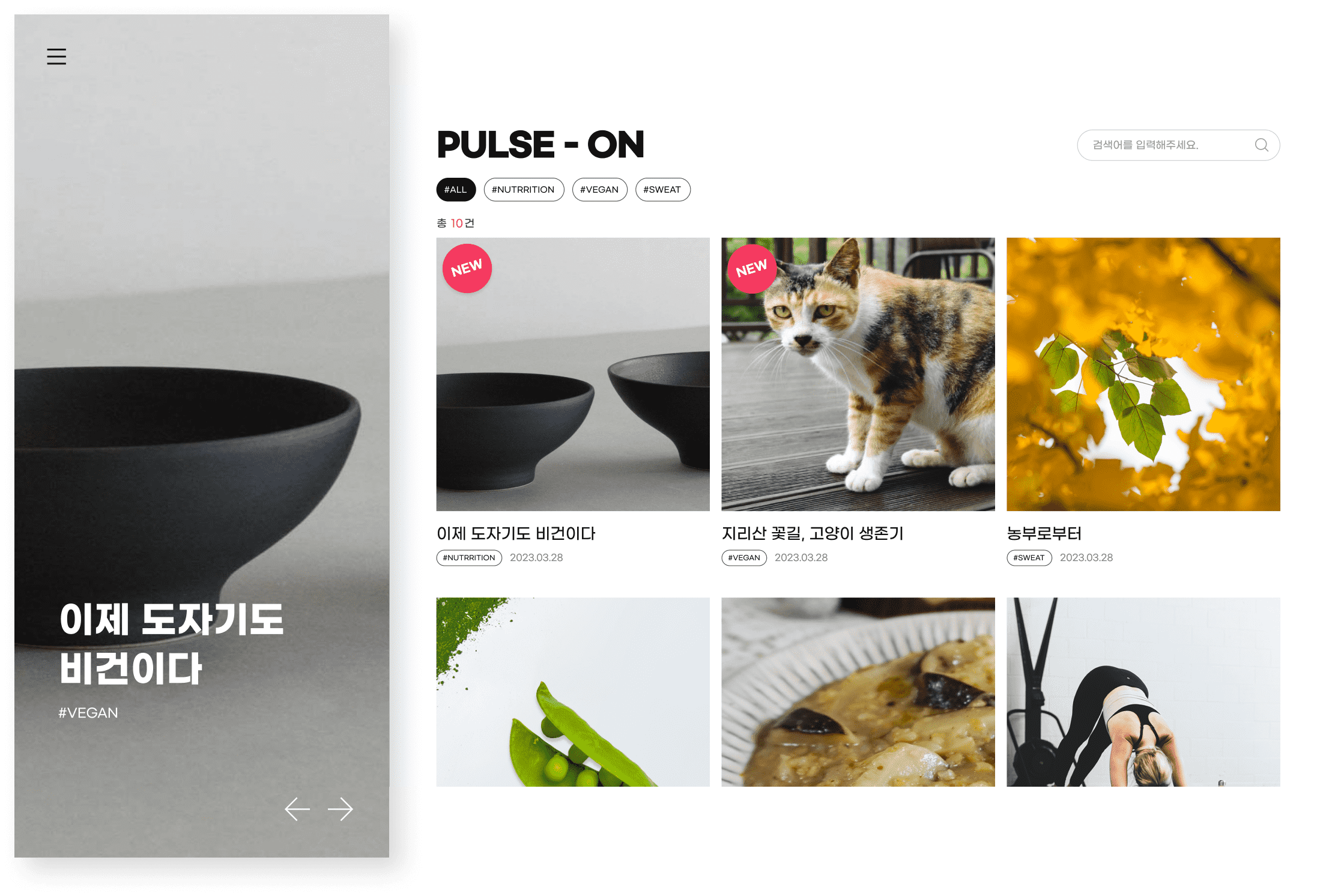
The Article menu utilizes a split screen structure to quickly check the desired content. The screen is largely divided into a banner area and a list area. The banner is designed with a vertical structure that is different from general banners, and the screen is structured so that you can quickly check the desired information through the tag function in the list area.
Various Contents Type
In the case of article details, it is composed of magazine, essay, interview, and webtoon types, allowing users to view various types of content in a new way. Additionally, it provides a wide range of content by exposing content related to the content currently being entered at the bottom.