Samsung SDS CX
Real Summit 2026 Brochure
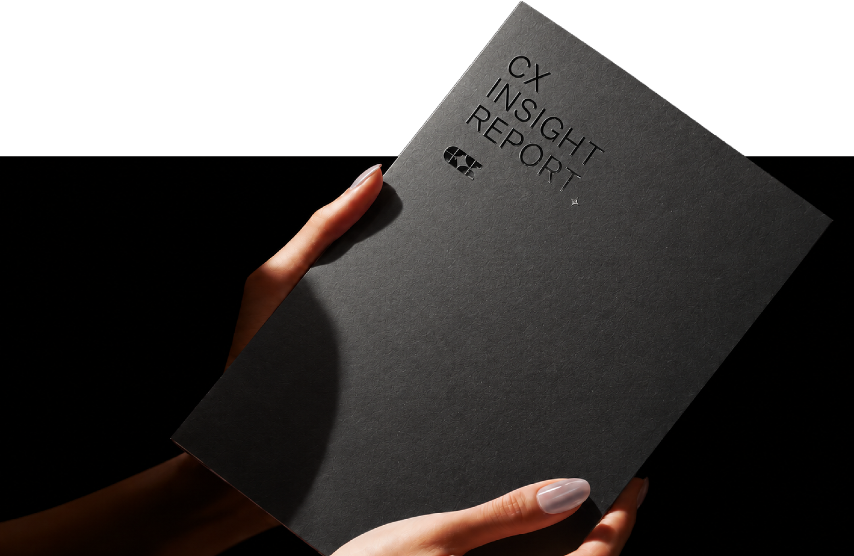
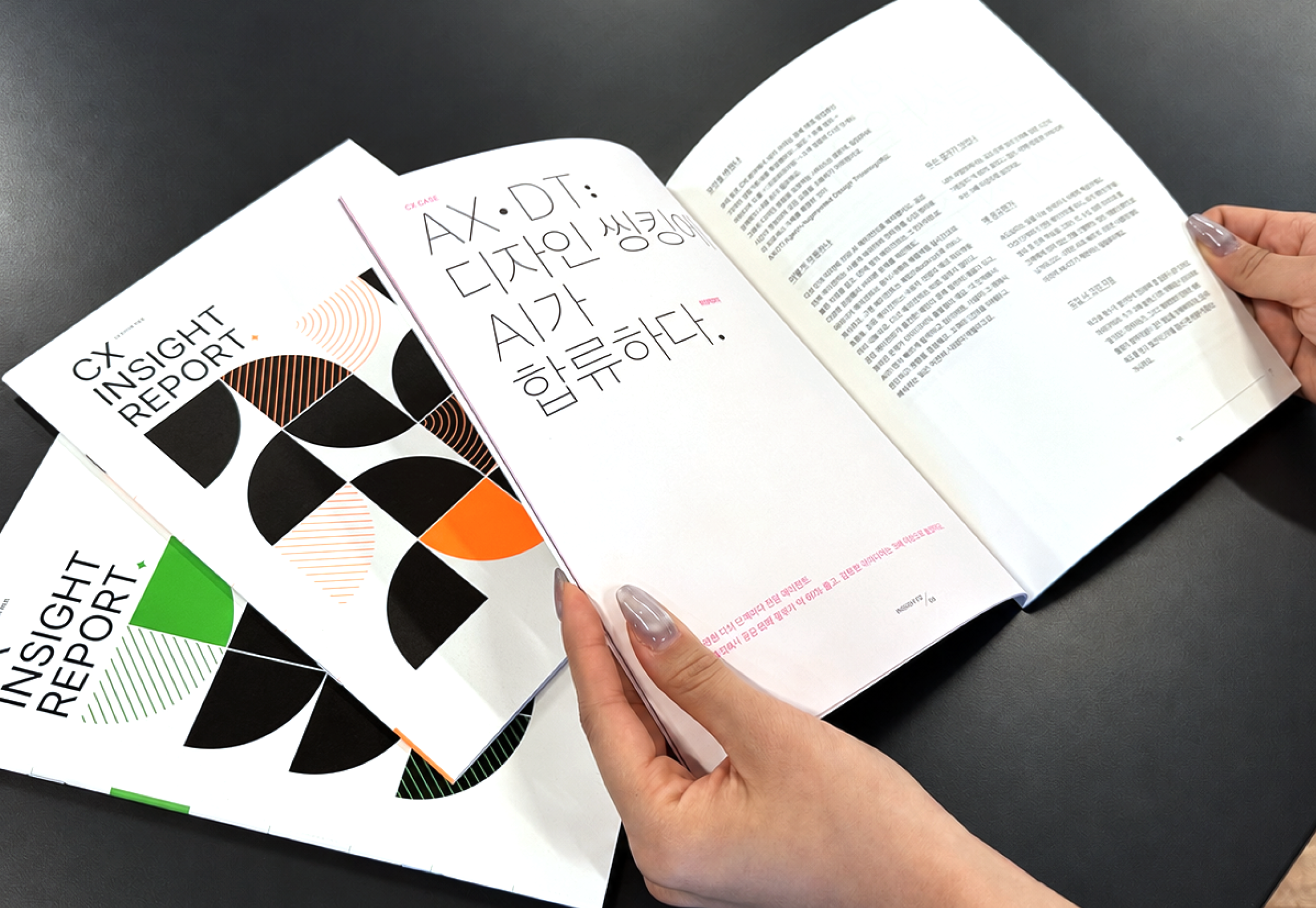
The Samsung SDS CX Real Summit 2026 Brochure Project was created to showcase AX innovation insights, AI technologies, and real-world applications across various industries at the Real Summit conference.
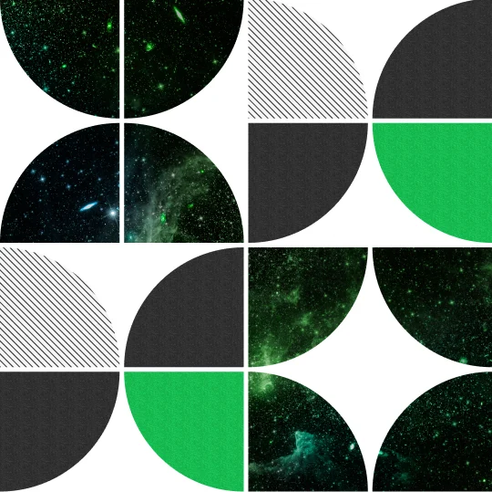
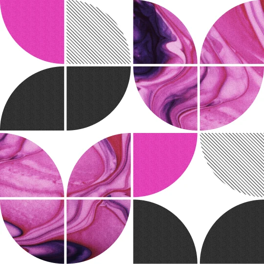
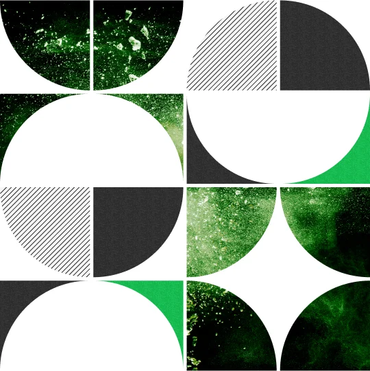
The project features nine AI insight articles, developed into both digital content and a printed brochure. The visual identity is built around a quarter-circle module derived from the CX corporate identity (CI). Distinctive patterns were developed to reflect the unique characteristics of each article, creating a cohesive and scalable visual system applied consistently across both digital and print media.


Pattern Construction Principle
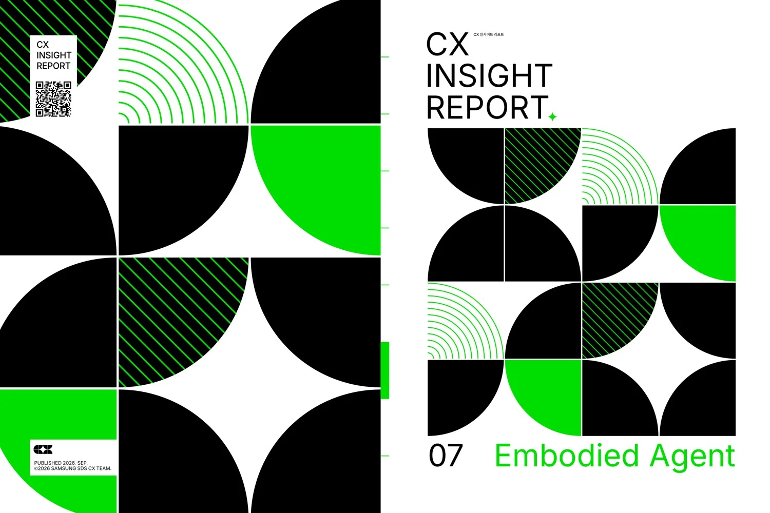
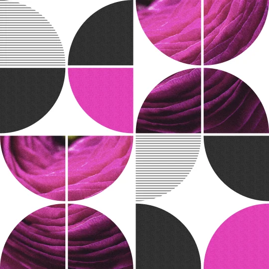
The 1/4 Circle, a key element of the CX corporate identity (CI), serves as the fundamental module of the visual system. Through three core principles—Rotate, Flip, and Repeat—the module expands into a diverse range of patterns.
By varying the combinations and arrangements of the same module, each pattern visually expresses the unique meaning and movement of its corresponding article. Organized within a structured grid, these patterns connect seamlessly to form a cohesive visual system that balances individual character with overall consistency.

Color
The primary colors for the three categories were defined as spot colors, with three vibrant fluorescent hues carefully selected to maximize their visual impact.
Color proportions were also fine-tuned to minimize visual differences between digital and print media, ensuring a consistent and cohesive color experience across both platforms.
















Brochure & Poster
Distinct colors were assigned to each article category to highlight the unique visual characteristics of the content. For the poster, the signature patterns of all nine articles were combined into a single large-scale graphic, reinforcing the overall visual consistency and impact of the content.



Print production was closely supervised to ensure optimal reproduction of the fluorescent spot colors.
The printing process was closely supervised to ensure that the vibrancy and color accuracy of the fluorescent spot colors matched the original design intent as closely as possible.
Through careful evaluation of printed proofs, color tones and ink densities were fine-tuned to maximize the visual impact of the fluorescent colors.