Theory

Greetings. We, HNINE, plan and manage from service concepts to digital product development.

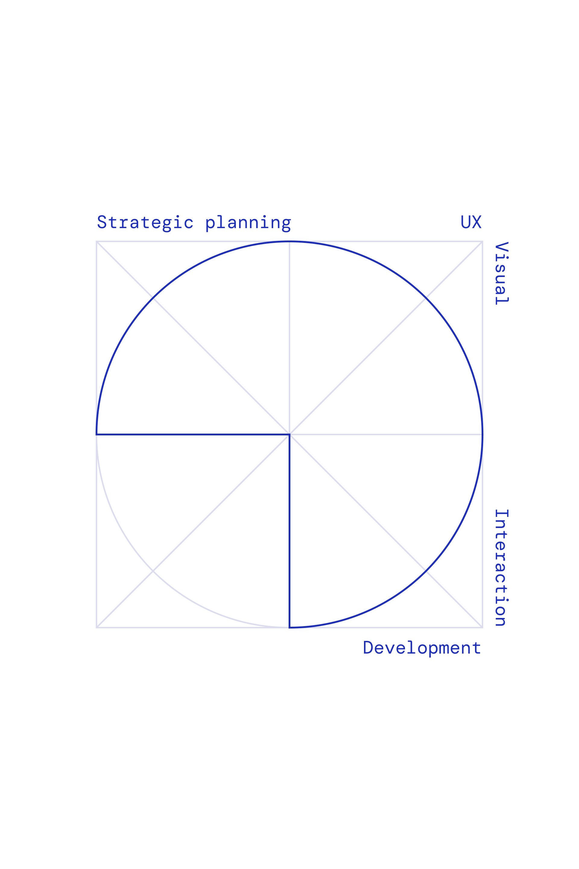
Communication between various segments is crucial as UX design solves communication issues between humans and machines based on mutual understanding. Our UX design starts with communication and offers a better user experience by adding technology.

Imagine IT. Create IT.

The newly designed identity of HNINE is based on the ‘9 hours’ we spend and refers to HNINE’s design and technology created by hniners. In HNINE, the Strategic Planning Office, UX Office, Visual Office, Interaction Office, and Development Office work together to create high-quality user experiences by adding technology to design.

hnine's symbol frame image
hnine's symbol frame image with meanning text of Strategic planning, UX, Visual, Interaction, Development
hnine's symbol frame image with meanning text of Design, Technology
hnine's logo in black background
layered hnine's logo in black background

Color

Through blue, which symbolizes trust, we have captured the image we intend to be represented to our clients as an agency.

The colors of the newly revamped homepage start with blue and green gradations, representing our vision and harmony among members.

Color

Color palette

The website’s primary color, blue, represents hniners trustworthiness, and the secondary color, green, represents fresh and creative ideas.

Gradient

gradient color palette

Gradients are used to represent the harmony among hniners and the vision of HNINE.

hnine's logo
Imagine IT. Create IT.
hnine's logo on blue background
hnine's logo with

Document
Guide line

체계적인 프로젝트 문서를 제작하기 위해 관련 요소에 대한 공통 가이드를 제공합니다.

본 가이드라인은 프로젝트 담당자가 조금 더 이해하기 쉽고 일관성있는 프로젝트 문서를 제작할 수 있도록 도움을 줍니다.

HNINE 문서 템플릿 다운로드

Standard

16:9 screen and 4:3 screen

16:9 와이드 스크린 비율을 기본으로 사용합니다. 필요에 따라 4:3 비율의 스크린을 활용할 수 있습니다.

Margin

콘텐츠와 화면 상하좌우 가장자리 공간에 일정 여백을 유지합니다. 콘텐츠의 내용에 따라 여백을 조정할 수 있습니다.

Typography

Typography range of Bold 700 to Extra Light 400

높은 가독성을 구현하는 고딕체를 사용합니다. Pretendard를 기반으로 다양한 굵기를 활용하여 정보를 효과적으로 전달할 수 있도록 Head-line, Subtitle, Body Text 등 용도에 맞게 사용되어야 합니다.

Pretendard 폰트 다운로드

Front Cover

Front cover

통일된 문서화를 위해 공통 가이드를 따릅니다. 표지 배경은 프로젝트에 따라 컨셉을 적절히 담아내 활용할 수 있습니다.

Title

Title

대타이틀과 서브 타이틀 활용하여 문서 내용을 명료하게 담아냅니다. 필요에 따라 서브 타이틀은 제외할 수 있습니다.

placed date at the bottom left of the document

Date

좌측 하단에 저작권 표기와 함께 문서 작업 날짜를 기입합니다.

placed client's logo at the top right of the document

Client Logo

제안서의 경우 우측 상단에 클라이언트 로고를 삽입합니다.

placed hnine's logo at the bottom right of the document

HNINE Logo

우측 하단에 에이치나인 로고를 삽입합니다.

Contents

Contnets
Header. Prject Name

Header

해당 페이지의 타이틀과 서브 타이틀로 Header를 구성합니다. 서브 타이틀은 2줄 이하를 권장합니다.

placed page at the bottom right of the document

Page

우측 하단에는 슬라이드 쪽수를 기입하여 페이지 위치를 파악할 수 있습니다.

placed project information at the bottom left of the docuemnt. client, output, creative fields

Project Information

제안서 등 해당 프로젝트의 정보를 요약하여 담아내야하는 경우에는 좌측 하단에 Client, Output, Creative fields를 기입합니다.

Hiearchy & Contrast

content in white background content in black background

제목과 텍스트 간 시각적 대비를 주기 위해 폰트 크기, 색상, 두께를 사용합니다. 또한 계층 구조를 이용하여 정보를 더욱 이해하기 쉽게 나타내어 콘텐츠를 구성할 수 있습니다. 어두운 배경일 경우에도 가독성을 높히는 스타일을 고려해야 합니다.